Lab 2
The goal of this lab is to effectively visualize numerical and categorical data.
For all visualizations you create, be sure to include informative titles for the plot, axes, and legend!
Getting started
Use these steps to navigate to
RStudiousing the Duke Container Manager;Use these steps to download the blank template
lab-2.qmdand the data setcourage.csvfrom our Canvas page, upload them to yourRStudiofiles, and move them into an appropriately named folder (lab-2, for instance);Once
lab-2.qmdis where it needs to be, open it, and verify that you can click the “Render” button inRStudioand get a PDF file. See this answer on Ed if you want more guidance here;Now proceed to complete the exercises in this lab.
Packages
In this lab we will work with the tidyverse packages, which is a collection of packages for doing data analysis in a “tidy” way.
Part 1: NC Courage
Today, we will be working with data from the first three full seasons of the NC Courage, a highly successful National Women’s Soccer League (NWSL) team located near Duke in Cary, NC. The Courage moved to the Triangle from Western New York in 2017 and had three epic seasons in NC, culminating in winning the championship game that was held at their stadium in Cary in 2019! Data for this lab was sourced from the nwslR package on Github, and verified with the NC Courage website by Meredith Brown (Duke StatSci ’21) in a previous semester.
courage <- read_csv("data/courage.csv")Recalling the information here, be prepared to adjust the file path to match how you have organized your files and folders.
The courage dataset has 78 rows and 10 variables. The variables in the dataset are as follows:
| Variable | Descripton |
|---|---|
game_id |
An unique ID for the game |
game_date |
Game date |
game_number |
Game number |
home_team |
Name of the home team, abbreviated |
away_team |
Name of the away team, abbreviated |
opponent |
The team NC Courage played against |
home_pts |
Number of points by the home team |
away_pts |
Number of points by the away team |
result |
Result of the game for NC Courage (win, loss, tie) |
season |
Season (2017, 2018, or 2019) |
Exercise 1
Create a bar plot of the results of games for NC Courage. Additionally, calculate the numbers of wins, losses, and ties. Write a one sentence narrative for your findings.
Hint: result is a categorical variable, so use a bar plot for the visualization and the count() function for calculating the frequencies of levels of this variable. This primer may help you get started with the plot.
Exercise 2
Create a new variable indicating whether the game was played at home or away for NC Courage. This variable should be called home_courage and take the value “home” if NC Courage is the home team and “away” if NC Courage is the away team. (Instructions for how to do this are given below.)
Then, calculate the number of home and away games, and write a one sentence narrative for your findings.
Use the example code below to get started.
There are two things of note here:
The use of the assignment operator (
<-) to assign the resulting data frame tocourage, thus overwriting thecouragedataset to contain this new column. We do this because we will use this new variable,home_courage, in a subsequent exercise.-
The use of a new function,
if_else()to determine whether the game is played at home or away.-
home_team == "NC"finds all rows where the home team is NC Courage. - If the home team is NC Courage, then we set the value of
home_courageto `“home”. - Otherwise (else) Courage must be the away team and we set the value of
home_courageto"away".
-
Exercise 3
- This code creates a visualization that displays the relationship between
home_courageandresult:
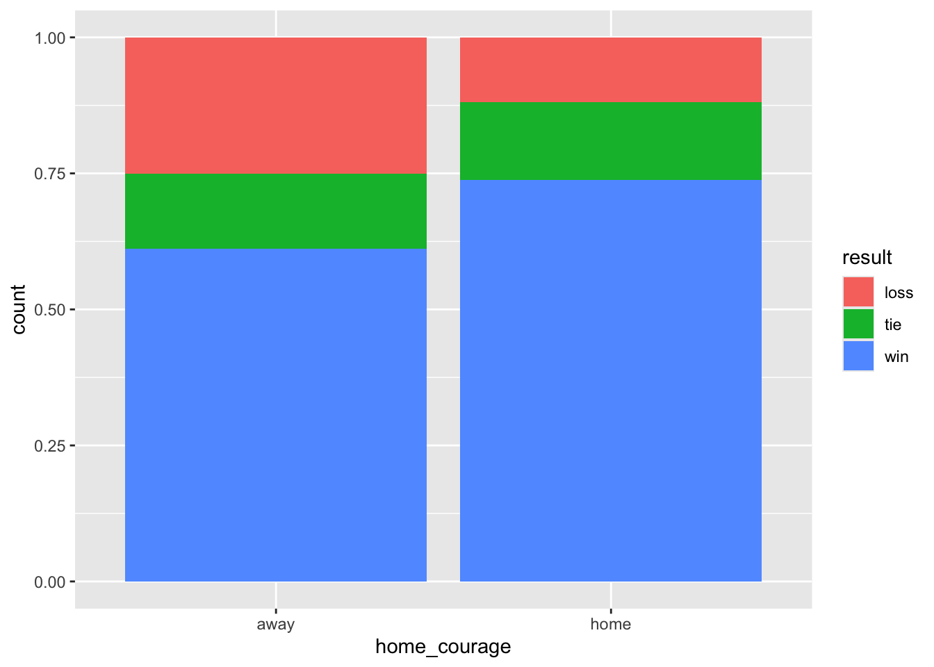
Explain what each piece of the code is doing. Why does it produce the plot that it produces?
Hint: to understand what the different ingredients do, try removing or altering some of them, and see how it changes the plot.
- Calculate the proportions of home and away games that the Courage won. Based on these, do your findings suggest a home-field advantage? Why or why not?
So far we have focused on whether the game was at home or away and whether the Courage won. Next, we dive deeper and focus on the number of points the Courage wins by, at home and away.
Exercise 4
How many points do the Courage typically win by (on average)? Use the example code below to get started. You’ll encounter a new function: abs() is the absolute value function. It takes the absolute value of a number. Why do we want to use this absolute value function here?
Hint: We are only interested in games the Courage wins, therefore we should filter() for those games first.
courage |>
  filter(___) |>
  mutate(win_pts = abs(home_pts - away_pts)) |>
  summarize(___)
Exercise 5
How many points do NC Courage score when they win (on average)? Note this is different than how many points they “win by”. How many points do the Courage score when they lose on average?
To calculate this we first need to determine how many points NC Courage scored in every game. We can use if_else() logic again to find this value for each game, and store it in a new column, courage_pts.
courage <- courage |>
  mutate(courage_pts = if_else(home_team == "NC", home_pts, away_pts))

courage |>
  group_by(___) |>
  summarize(___)
Exercise 6
Next we’ll investigate visually whether or not NC Courage has a home-field advantage. Mutate the courage data frame to create two new variables:
total_pts: Sum of points scored by both teams, i.e.home_pts + away_pts.opponent_pts: Points scored by the opposing team, i.e.,total_pts - courage_pts.
Save the resulting data frame as courage again and print the three points columns (total_pts, opponent_pts, courage_pts) to screen.
Hint:
- Use the
mutate()function to create the columns.
courage <- courage |>
  mutate(
    total_pts = ___,
    opponent_pts = ___
)- Use the
select()function to print them to screen:
courage |>
  select(total_pts, opponent_pts, courage_pts)
Exercise 7
Create a scatter plot:
opponent_pts(y) vs.courage_pts(x)Color the scatter plot by whether NC Courage are home or away.
Represent the data with “jittered” points wth
geom_jitter().Overlay a \(y = x\) line with
geom_abline().Faceted by season.
What does the line represent? What does it mean for a point to fall above the line? Below the line?
ggplot(courage, aes(x = ___, y = ___, color = ___)) +
  geom_jitter(width = 0.1, height = 0.1) +
  geom_abline(slope = 1, intercept = 0) +
  facet_wrap(~ ___) +
  labs(
    x = "___",
    y = "___",
    title = "___",
    color = "___"
  )
Exercise 8
If we want to formally test whether the Courage have a home-field advantage, then we must first define what this means! In your own words, what do you think a home-field advantage means? Then, now that you’ve defined what it means to have a home field advantage, define what it means to not have a home-field advantage.
While there is a right answer, this part is graded for completion, so don’t worry too much about answering this in exactly the right way. Although graded for completion, your response must make sense to receive full points.
Part 2: IMS Exercises
The exercises in this section do not require code. Make sure to answer the questions in full sentences.
Exercise 9
IMS - Chapter 2 exercises, #20: Vitamin supplements.
Exercise 10
IMS - Chapter 2 exercises, #30: Screens, teens, and psychological well-being.
Lastly…
Recommend some music for us to listen to while we grade this.
Wrap up
Submitting
Before you proceed, first, make sure that you have updated the document YAML with your name! Then, render your document one last time, for good measure.
To submit your assignment to Gradescope:
Go to your Files pane and check the box next to the PDF output of your document (
lab-2.pdf).Then, in the Files pane, go to More > Export. This will download the PDF file to your computer. Save it somewhere you can easily locate, e.g., your Downloads folder or your Desktop.
Go to the course Canvas page and click on Gradescope and then click on the assignment. You’ll be prompted to submit it.
Mark the pages associated with each exercise. All of the papers of your lab should be associated with at least one question (i.e., should be “checked”).
If you fail to mark the pages associated with an exercise, that exercise won’t be graded. This means, if you fail to mark the pages for all exercises, you will receive a 0 on the assignment. The TAs can’t mark your pages for you, and for them to be able to grade, you must mark them.
Grading
| Exercise | Points |
|---|---|
| Exercise 1 | 5 |
| Exercise 2 | 5 |
| Exercise 3 | 6 |
| Exercise 4 | 6 |
| Exercise 5 | 6 |
| Exercise 6 | 4 |
| Exercise 7 | 6 |
| Exercise 8 | 2 |
| Exercise 9 | 5 |
| Exercise 10 | 5 |
| Total | 50 |
Acknowledgements
This assignment was adapted from a similar exercise by Dr. Alex Fisher.