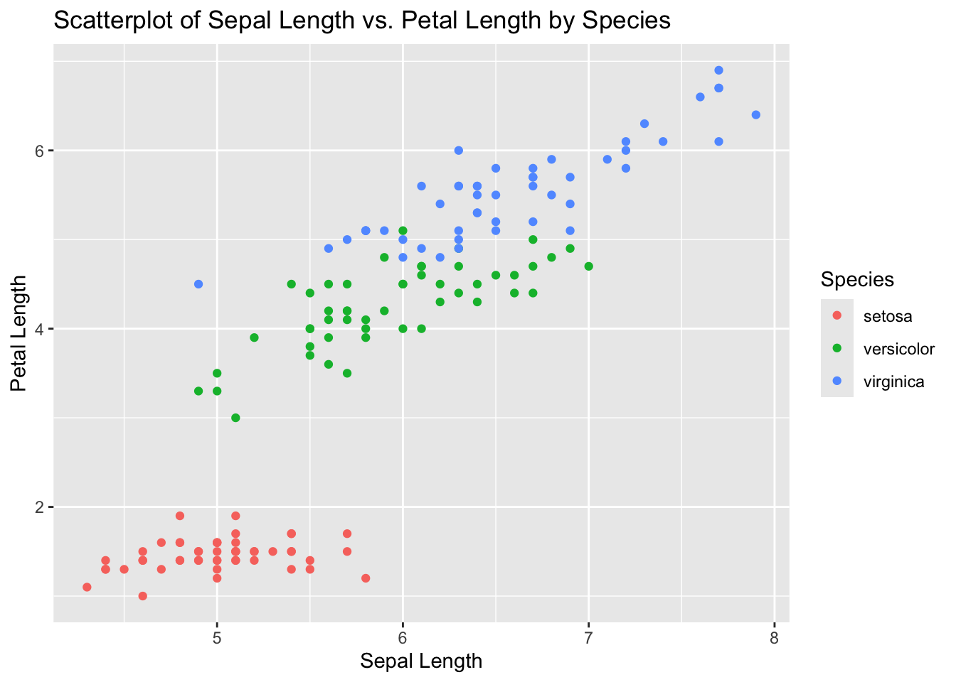
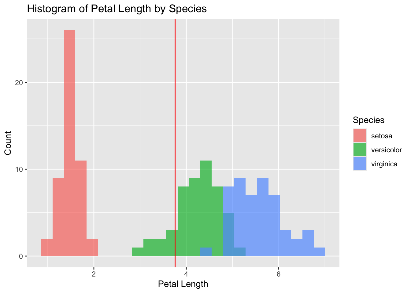
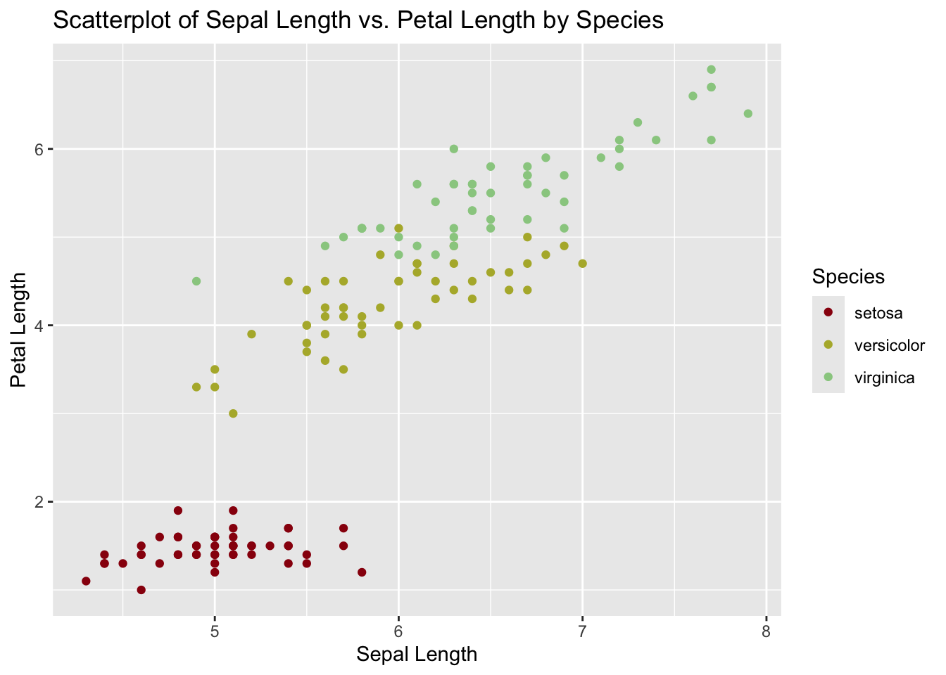
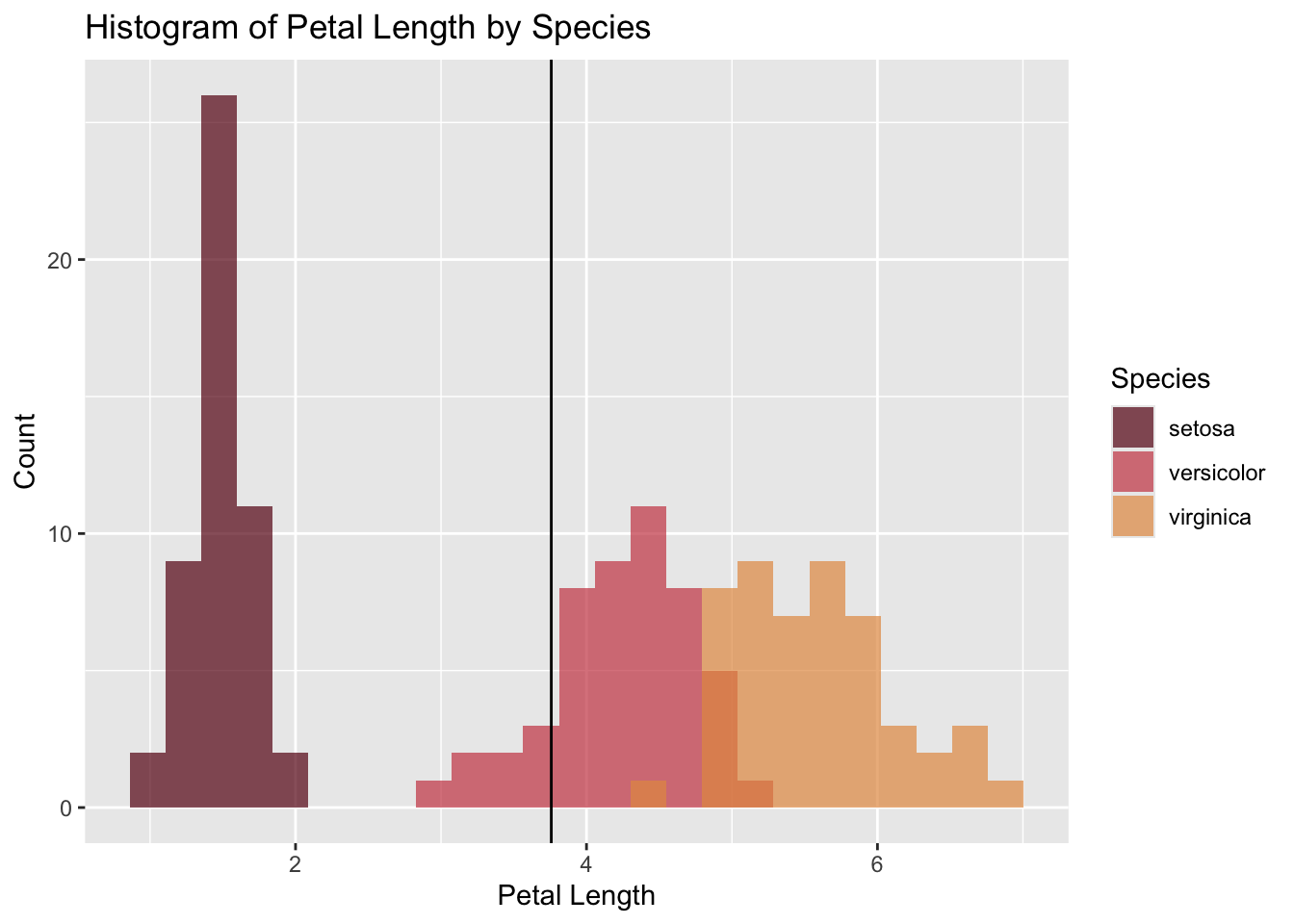
We’ve seen many examples of plots in which we make use of the “color” and “fill” arguments to map unique values of some categorical variable to different colors in a resultant plot. Below are two examples, for reference, using Fisher’s Iris data (iris).
library(ggplot2)iris |>ggplot(aes(x = Sepal.Length, y = Petal.Length, color = Species)) +geom_point() +labs(x ="Sepal Length",y ="Petal Length",color ="Species",title ="Scatterplot of Sepal Length vs. Petal Length by Species")
mean_value <-mean(iris$Petal.Length)iris |>ggplot(aes(x = Petal.Length, fill = Species)) +geom_histogram(bins =25, alpha =0.7, position ="identity") +geom_vline(xintercept = mean_value, color ="red") +labs(x ="Petal Length",y ="Count",fill ="Species",title ="Histogram of Petal Length by Species")
Pretty Plots
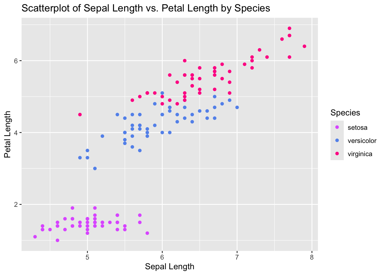
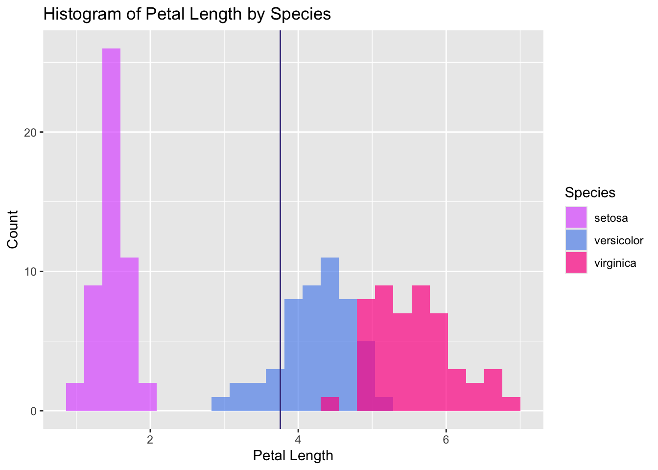
One of the fun parts about becoming proficient in R is the ability to create visually appealing plots over which you, as the author and statistician, have full design authority. If you’re bored of R’s primary color palette that has less flare than a toddler’s finger-painting, let’s spice it up! A good reference for any budding R-based graphic designer is this color cheatsheet, which lists ~7 pages worth of colors and their corresponding names in R. The code below is a helpful reference for using “scale_color_manual” and “scale_fill_manual” to manually color your R plots.
iris |>ggplot(aes(x = Sepal.Length, y = Petal.Length, color = Species)) +geom_point() +scale_color_manual(values =c("mediumorchid1", "cornflowerblue", "deeppink")) +labs(x ="Sepal Length",y ="Petal Length",color ="Species",title ="Scatterplot of Sepal Length vs. Petal Length by Species")
iris |>ggplot(aes(x = Petal.Length, fill = Species)) +geom_histogram(bins =25, alpha =0.7, position ="identity") +geom_vline(xintercept = mean_value, color ="slateblue4") +scale_fill_manual(values =c("mediumorchid1", "cornflowerblue", "deeppink")) +labs(x ="Petal Length",y ="Count",fill ="Species",title ="Histogram of Petal Length by Species")
The Wizarding World of R
Ah, the wonders of the R community and open source software. If you have some extra time on your hands and want to get extra creative, I encourage you explore the wide world of R and search around for off-the-shelf themed color palettes created by other R fanatics for public consumption. With a bit of Googling, you can find some pretty cool themed palettes (F1, Barbie, Oppenheimer, GOT, to name a few). Visit this site and check out the code below for an example of Harry Potter themed plots!
library(harrypotter)iris |>ggplot(aes(x = Sepal.Length, y = Petal.Length, color = Species)) +geom_point() +scale_color_hp_d(option ="HarryPotter", name ="Species") +labs(x ="Sepal Length",y ="Petal Length",color ="Species",title ="Scatterplot of Sepal Length vs. Petal Length by Species")
iris |>ggplot(aes(x = Petal.Length, fill = Species)) +geom_histogram(bins =25, alpha =0.7, position ="identity") +geom_vline(xintercept = mean_value, color ="black") +scale_fill_hp_d(option ="HermioneGranger", name ="Species") +labs(x ="Petal Length",y ="Count",fill ="Species",title ="Histogram of Petal Length by Species")