library(tidyverse) Histogram basics
A histogram displays the distribution or variability of numerical data. It shows you where the data values are typically concentrated, how spread out they are, and whether or not there are any asymmetries.
This primer leads you down the path of least resistance to producing a histogram plot using R. Trust me; you would not want to do this by hand.
Loading a package
The command for plotting a histogram is contained inside the tidyverse package, so you need to load that first:
Loading a dataset
Next, we need something to plot, so let us load in a data set. We will consider the flint water data that was mentioned during the second lecture on 8/29/2024:
flint <- read_csv("flint.csv")Let us unpack what this is doing:
read_csvis a function, just like \(f(x)=x^2\) or \(f(x)=ax+b\) from your math class. It receives an input, and returns an output. The input is the name of a file:"flint.csv". The output is a data frame (a spreadsheet) inR;- When you run
read_csv, it returns a data frame. But if you don’t give that data frame a name and store it someplace, then you can’t actually use it. So that’s what theflint <-part is doing. You are assigning the output ofread_csvto a variable named “flint.” If this went as planned, you should seeflintlisted in the upper right Environment tab ofRStudio:
Note
Recalling the information here, you may have to modify the file path to something like "~/lecture-2/flint.csv" to match the particular way you have chosen to name and organize your files and folders.
Plotting a histogram
Here is the basic command in all its glory:
ggplot(flint, aes(x = lead)) +
  geom_histogram(bins = 250) +
  coord_cartesian(xlim = c(0, 100))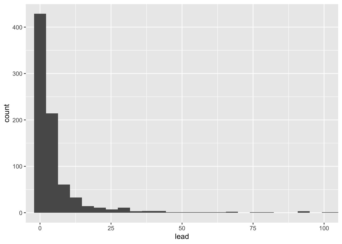
Now let’s talk about it:
ggplot(flint, aes(x = lead))is where we tellRwhat data frame we are using (flint) and which variable (column) in that data set we want to plot (lead);- Next, we use
geom_histogram(bins = 250)to tell it that we specifically want a histogram with 250 bins; - Last, we use
coord_cartesian(xlim = c(0, 100))to adjust the bounds of the horizontal axis: start at x = 0 and end at x = 100; - We stitch all of these requests together using the
+sign, and to make things more readable (not run off the page), we put a new line after each+.
Adding a vertical line to the histogram
When plotting a histogram, it can also be useful to indicate on the plot the location of some particularly meaningful summary statistics, such as the mean or median. In order to do this, we can use the same basic command from the previous section, but then add some extra layers that will place vertical lines on the plot at those values:
mean_value <- mean(flint$lead)
median_value <- median(flint$lead)

ggplot(flint, aes(x = lead)) +
  geom_histogram(bins = 250) +
  coord_cartesian(xlim = c(0, 100)) +
  geom_vline(xintercept = mean_value, color = "red") +
  geom_vline(xintercept = median_value, color = "blue")
Notice that the distribution of lead levels is positively skewed, which results in the mean being larger than the median.
Now you try
To double check that you can follow these instructions, redo everything above using a different data set. This may require you to modify the code in various ways:
- the file path you provide to
read_csv; - the name you assign to the resulting data frame;
- the variable you plot in
aes(x = lead); - the number of histogram bins;
- the range of the horizontal axis.
Check that you are comfortable making these changes.