library(tidyverse)Barplot basics
A barplot is similar to a histogram, but instead of visualizing numerical data, we are visualizing categorical data. Each bar in the chart is counting the number of observations (rows) that correspond to each level of the categorical variable.
Load a data set
Let’s load the data from the 2020 Durham City and County Resident Survey (originally in the Canvas lecture 4 folder), where each row is a Durham resident:
durham <- read_csv("durham-2020.csv")
Note
Recalling the information here, be prepared to adjust the file path to match how you have organized your files and folders.
One of the columns in this data set is a categorical variable called would_you_say_your_total_annual_hous_35, with four levels corresponding to the resident’s income:
- Under $30,000;
- $30,000-$59,999
- $60,000-$99,999
- $100,000 or more
Furthermore, some folks left this part of the survey blank, and so their income information is missing, which effectively creates a fifth category. Before plotting, let us quickly modify the data to give this income variable a more concise name, as well as making it a proper factor type in R:
durham <- durham |>
  rename(income = would_you_say_your_total_annual_hous_35) |>
  mutate(income = as_factor(income))
The basic plot
ggplot(durham, aes(x = income)) +
  geom_bar()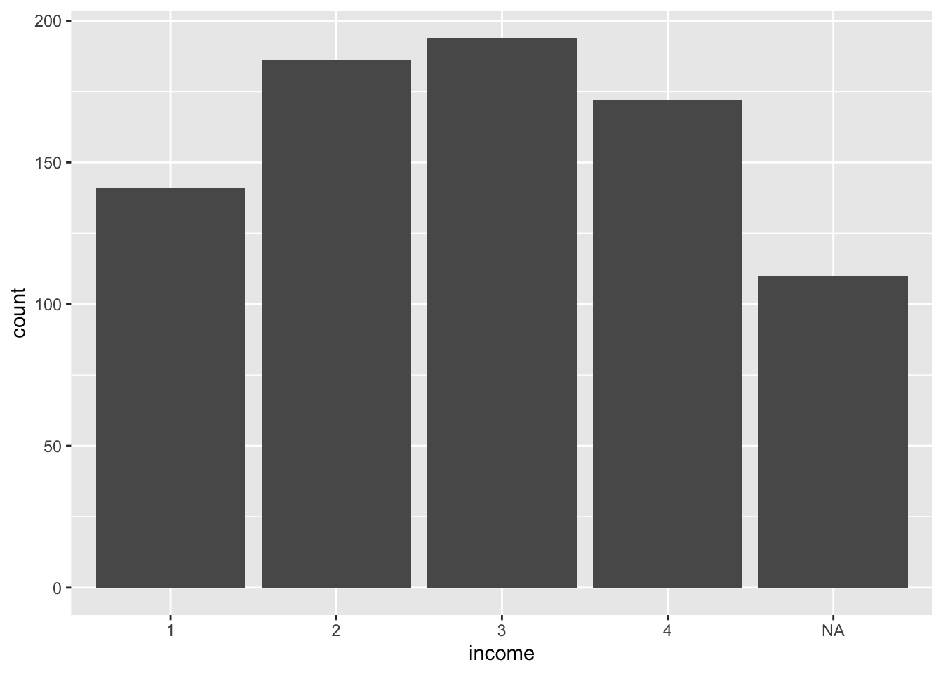
The basic template here is very similar to what we saw for the histogram. The first layer uses ggplot to indicate what data you wish to plot. Then the next layer uses geom_bar to specifically make it a bar plot.
In the first layer we used x = inside aes to make the bars vertical, but we could have made them horizontal as well:
ggplot(durham, aes(y = income)) +
  geom_bar()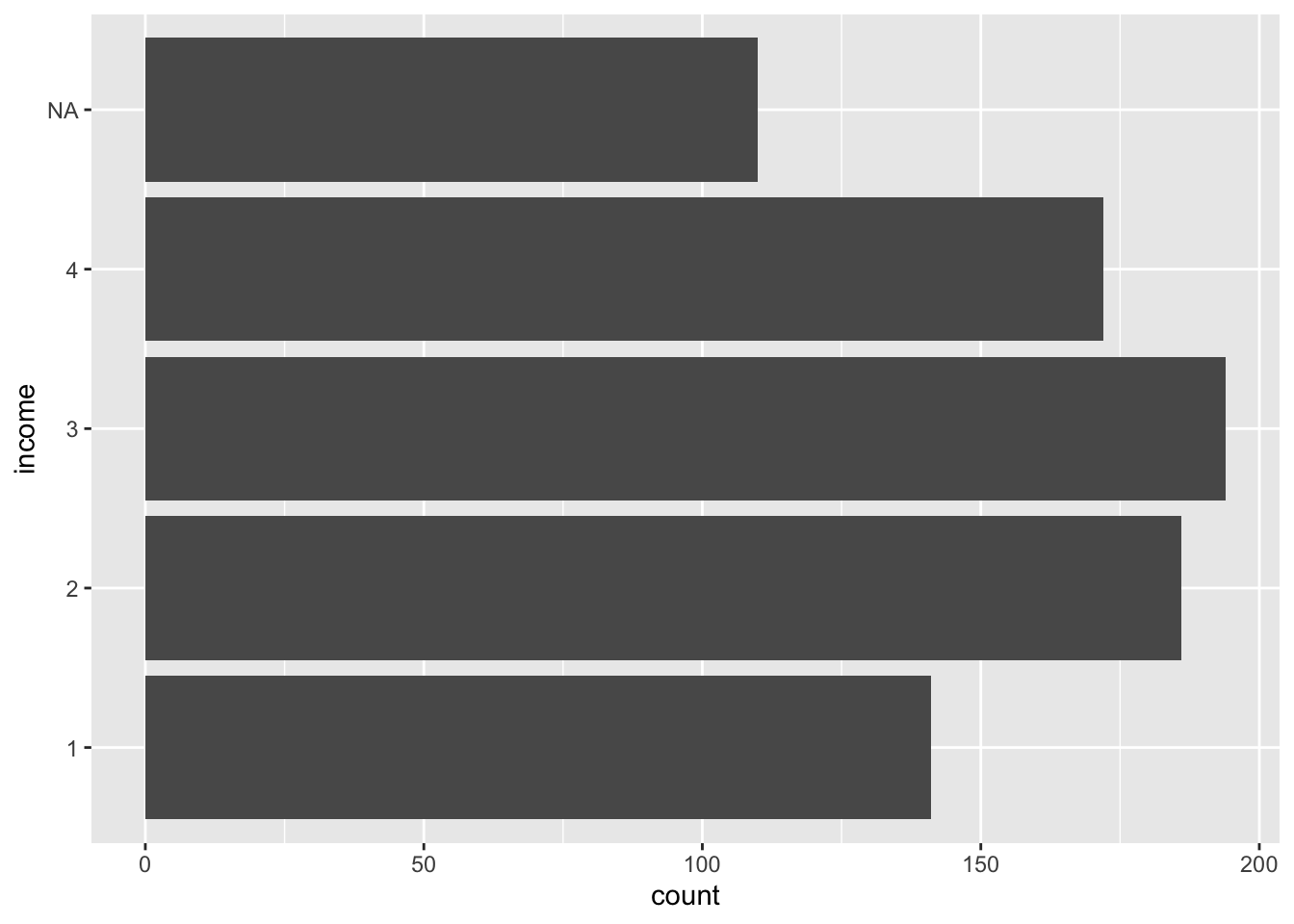
Do you see what changed?
Adding layers to prettify it
We could call it a day at this point, but the basic plot is rather drab. Here is some code that would zhuzh it up in a big way:
durham |>
  ggplot(aes(y = income, fill = income)) +
  geom_bar(show.legend = FALSE) +
  labs(
    x = "Count",
    y = NULL,
    title = "Would you say your total annual household income is..."
  ) +
  scale_y_discrete(
    labels = c(
      "1" = "Under $30,000",
      "2" = "$30,000-$59,999",
      "3" = "$60,000-$99,999",
      "4" = "$100,000 or more"
    )
  )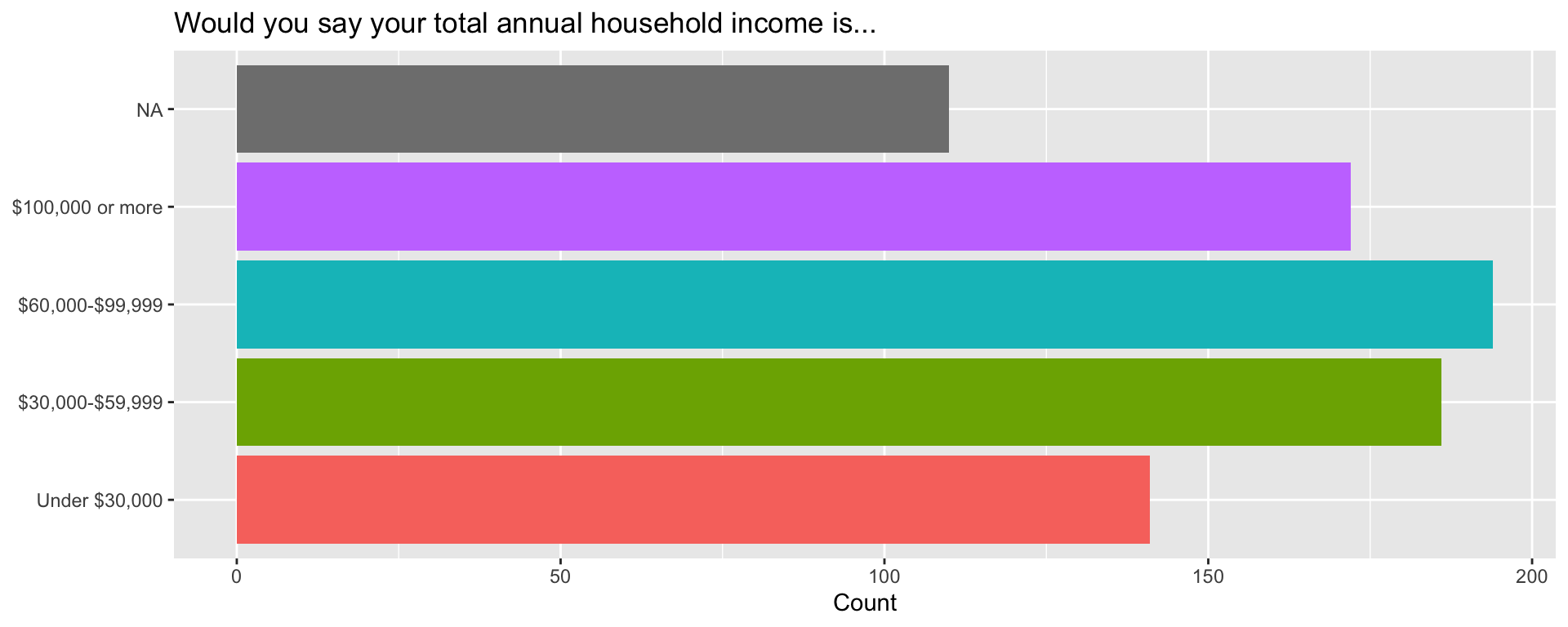
- The first
ggplotlayer tells it what data to use. We also added thefill =argument insideaesto apply a default color scheme; - the
labslayer allows us to add a title and label the axes; - the
scale_y_discretelayer allows us to replace the bar labels 1, 2, 3, 4 with more informative text that explains what the levels of the variable actually mean; - in between every layer, we have a
+. Gotta have that icing!